The Choreography of Space, or how to make your interior design have a great experience.
One design concept we bring to every project is what we call a 'Choreography of Space'. "Choreography" in an architectural context is the idea that a space should 'unfold' as you move through it, directing your experience and attention along the way for maximum effect. Through the design, form, and subtle clues, the space creates specific areas and transitions between areas where you have a specific sort of experience.
Japanese gardens make wonderful use of this idea to pack a lot into a little space. Next time you visit one, pay attention to how they manipulate the ground and pathways and plantings to direct your eyes and feet and the 'feel' of where you are. Imagine this; you're walked into a lovely japanese garden, and are standing by a pond. The ground is smooth and flat, and you look out at the amazing open view of the garden. To your right, you see the hint of another smaller clearing on the shore of the pond. You then notice a tiny path farther to your right that you decide to follow, which turns away from that view, and dives into some dense bamboo. The ground becomes uneven, so you look down at your feet, and notice the amazing little tiny flowers in the undergrowth. As the path turns, it gently turns you a different way back towards the pond, which is now blocked from your view by all the plants. The path suddenly opens up at another little clearing, the ground smoothing back out. This clearing is smaller, more private, with a little bench half facing you and half facing the pond. You stop and think for a moment about what you'd see when you sit on that bench, and so you turn to your left and find another amazingly curated vista across the pond, looking at the garden from a new angle, and realize this is the little clearing you saw earlier.

You've maybe only moved about ten feet as the crow flies, but you've experienced a whole journey! You saw a hint of where you were going to go, but then the plantings and uneven ground directed your attention to what's immediately in front of you and slowed your walking. The plantings also blocked your view when transitioning between "vistas", and the tiny details along the way made you feel like you were going somewhere. Then you arrive, the hint of a bench gets you to turn and look up, and a big reveal happens with an amazing view. And a bench to then enjoy that space and it's different identity than where you started, which you can see from here, and see how the two spots relate to each other.
This all sounds pretty 'fuzzy' and fluffy, but when applied to our built environment it can have a profound effect. It's one of the things that gives a building or a space a real identity. And when done well, it makes the space meet it's goals much better. From Apple Stores to Disneyland to casinos, enormous amounts of time and money are spent on this topic, because it really pays off. By purposely directing people's attention and experience the best features of a space can be celebrated, that space's goals better met, and the space's drawbacks minimized.
How does this work in an indoor space? Let's take a look at a recent project we did, The Interval at The Long Now, as a prime example.

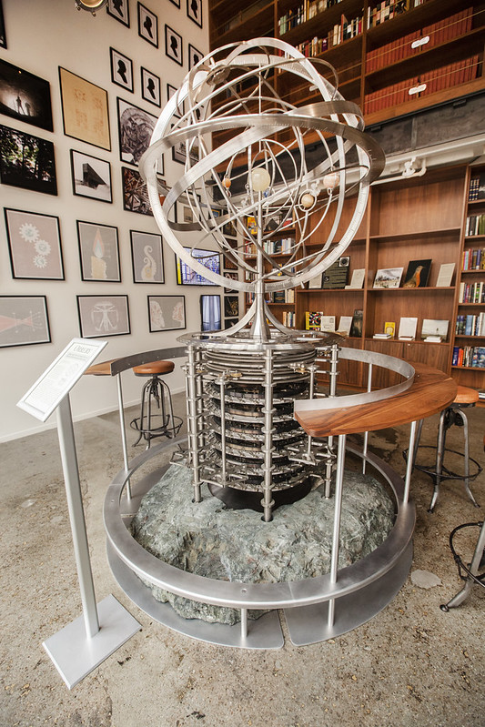
When walking by on the street, the combination of huge welcoming doors, warm lighting, and the spectacle of the stunning Orrey draw people into the space, curious to explore.

The just-right-sized open floor space in front of the Orrery, and the table around the Orrery giving it more 'presence' in the space, causes one to pause and look around for a moment. Seeing the bookcases beyond, the eye is drawn up and to the right, and then down towards just the corner of the bar and the chalkboard robot.

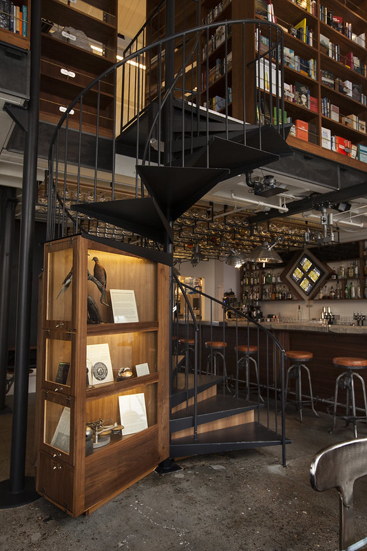
Looking towards the bar, the long table made from the Chime Generator prototype makes the space feel much bigger than it really is. As you move that direction, to see more of the bar perhaps, as it's mostly hidden from this vantage point behind the wunderkammer under the stairs. This element draws your eye towards it as you pass it, with lots of small details and interesting stories of all the various projects the Long Now is doing, encouraging you to slow down to have a nice transitionary moment along the way.

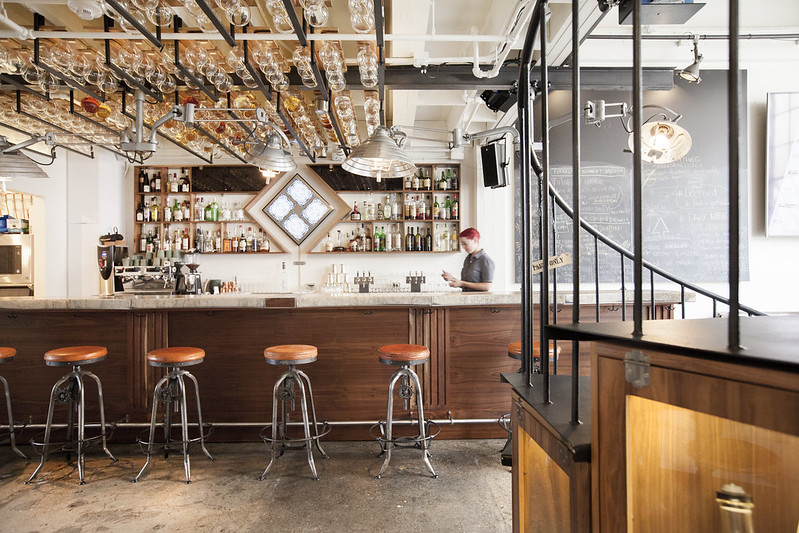
The rounded shape of the wunderkammer encourages you to turn, and the entire bar is revealed. The Brian Eno artwork behind the bar and overhead hanging lights once again draw your eyes up, to see the lovely glowing bottles hanging overhead, which stretch all the way to the little back room and booths along the wall.

What a good idea it seems now to get a coffee or a cocktail, and either hide away in that back room, or join some friends you saw at the big table as you walked in.

This is just one briefly summarised 'path' where we thought deeply about how people would move from the street outside to the bar itself when exploring the space for the first time. The goals were to draw people in, briefly explain the Long Now's mission and projects, and introduce them to all the main elements within this small space quickly while keeping enough mystery intact for further exploration.

Thinking this way about space requires a deep understanding of people, trying to view the experience of the space from many vantage points, and a clear definition of the goals our client has for that space. It's a human-centric powerful design tool we use on every project, and we work hard and closely with our clients to realize the best choreography and experience we can for their project and all it's users. Just think of what we could do together!

